
Many of us have old photographs that we think would look better in colour, and with modern software packages it is easier than ever to get this done with minimal effort, but a considerable amount of time. This article looks at using Gimp and Affinity Photo for colourising your old photographs. There are plenty of tutorials available for Photoshop.
Stage One
The first stage is to scan in your old black and white photograph. Usually you would do this at the best optimal quality, so choose the highest DPI that your printer will scan at (I usually use 1200) and then save the image as a .TIFF file for optimal quality. If your printer only saves in jpeg, simply take the output file and load it into an editing package and then save it as a .TIFF file.
Stage Two
Do some basic adjustments to your image such as adjusting the contrast and brightness. Set it so you can clearly see any distinguishing features etc. An example could be, if there are two people standing together looking like they are joined as the levels are so close, a slight adjustment to contrast should separate them. Straighten and crop your image so you don’t needlessly paint areas you won’t use, and finally do so very basic cleaning up if there are spots or tears to the image (don’t worry too much as this will be looked at later).
Stage Three
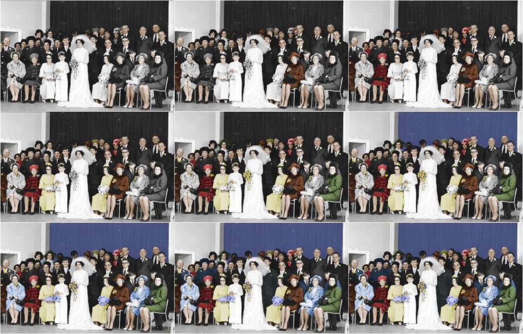
Start colouring in the image! You can use common sense when choosing colours, you’ll have an idea of what the colours should be by the shades of grey. Lighter greys will be whites, yellows, light blues etc, while darker greys will be reds, navy’s, blacks etc. You can alter the colours at any point, so don’t worry if they don’t look perfect straight away.
How To Colour The Image once you’ve loaded the new image.
Affinity Photo:
1. Choose the Colourise option
2. Select a colour from the colour chart, the whole screen will change to that colour. Play around with its huge, saturation and opacity and you’ll soon understand how it works.
3. When you are happy with the colour invert the image (Ctrl+I).
4. Make sure the paint brush is chosen and choose White to paint in the colour you want. If you make a mistake and need to run out where you’ve painted, turn the brush to Black.
5. Once you have coloured all the areas you need to, go back to stage 01.
GIMP:
1. Create a new layer for your colour.
2. Select the colour you need and the brush that you need. You can adjust the layer opacity to change the colour once painted.
3. Select the blending type of the layer to “Multiply” and paint the areas you want with the colour.
4. Once you have finished painting in one colour, create a new layer for the next colour and repeat these steps.
5. Flatten your image once complete.
You should rename each layer that colourising creates by double clicking on the layer name and choosing a name (or Red). This makes it easier when you start to have multiple colours. Generally when editing, the skin tones are usually done first so that you can match the other colours to the people’s skin. Colours will come out in different shades depending on the grey underneath, so you don’t need to paint in hundreds of colours as a few basic colours will instantly feel like much more.
If you need to leave it for another day in the middle of editing, just “Save” the image and it will save as an Affinity file, remembering each step you have done.
Note: You will edit the image differently if it is for printing or not. If you are printing you can generally get away with not filling in the very small details (such as eyes and mouths if there’s a large group of people). Single portraits might need more precise work. If you are not printing, then you can keep editing forever! Remember, no-one is going to scrutinise your image at 400%, so just keep it simple!
Stage Three
The third stage is cleaning up the image and fine-tuning the colours. You can use the inpainting or spot healing brush on small areas an clean up the image in order to get rid of any blemishes.
Stage Four
If you are going to print the images, do a test print on 6×4 photograph paper to test the colours. Remember, editing to print and editing for the screen are two separate things. Take a look at your printed test image and make any adjustments that you need.
Erasing Mistakes Or Correcting Colours
Should you make a mistake while colouring, or decide to go back to amend a mistake, go to the layer or the colour you need to correct and choose the Eraser Tool in Gimp, or select black or white (depending if your image is inverted) in Affinity photo and erase the area with this.
If you need to adjust a colour of a layer, there are various approaches you can take. In Gimp, the easiest was is to select the layer you need to change and then choose Colors>Colorize and change the colour settings in the option.
Conclusion
The art to colourising an old photograph is to keep the colours you are using down to a minimum, but keep them as accurate as you can. Don’t get hung up on the tiny details if you are going to print out your image as the printing process will not show these details as much as you think. Also, when you are editing, don’t forget to take a break now and again and save your progress, as there is nothing worse than getting along way into colouring and losing the work you have done.
Hopefully this will be useful. The techniques can be applied to other software, so feel free to experiment and start colourising those photographs!

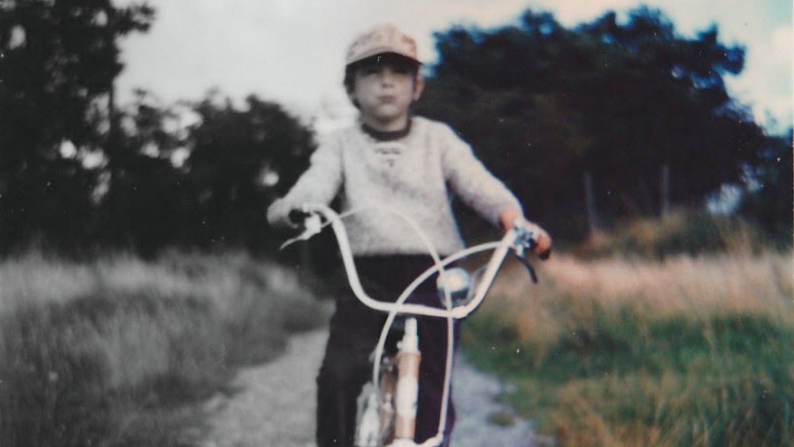
Original Scan Of B&W Image 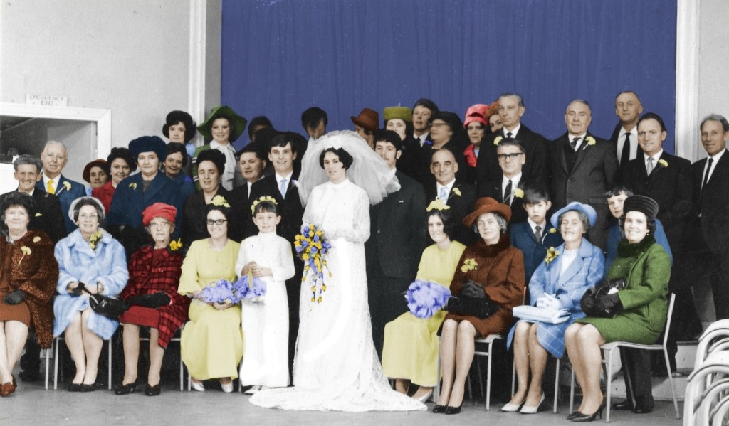
Colourised Version 
An A4 Print Which Was Framed


I was only given a very low quality image for this one, but it highlights how good just a few little touches can make to your photo.

Great information, thanks for the tips
LikeLike
Thank you, if you have any suggestions for more then please let me know.
LikeLiked by 1 person