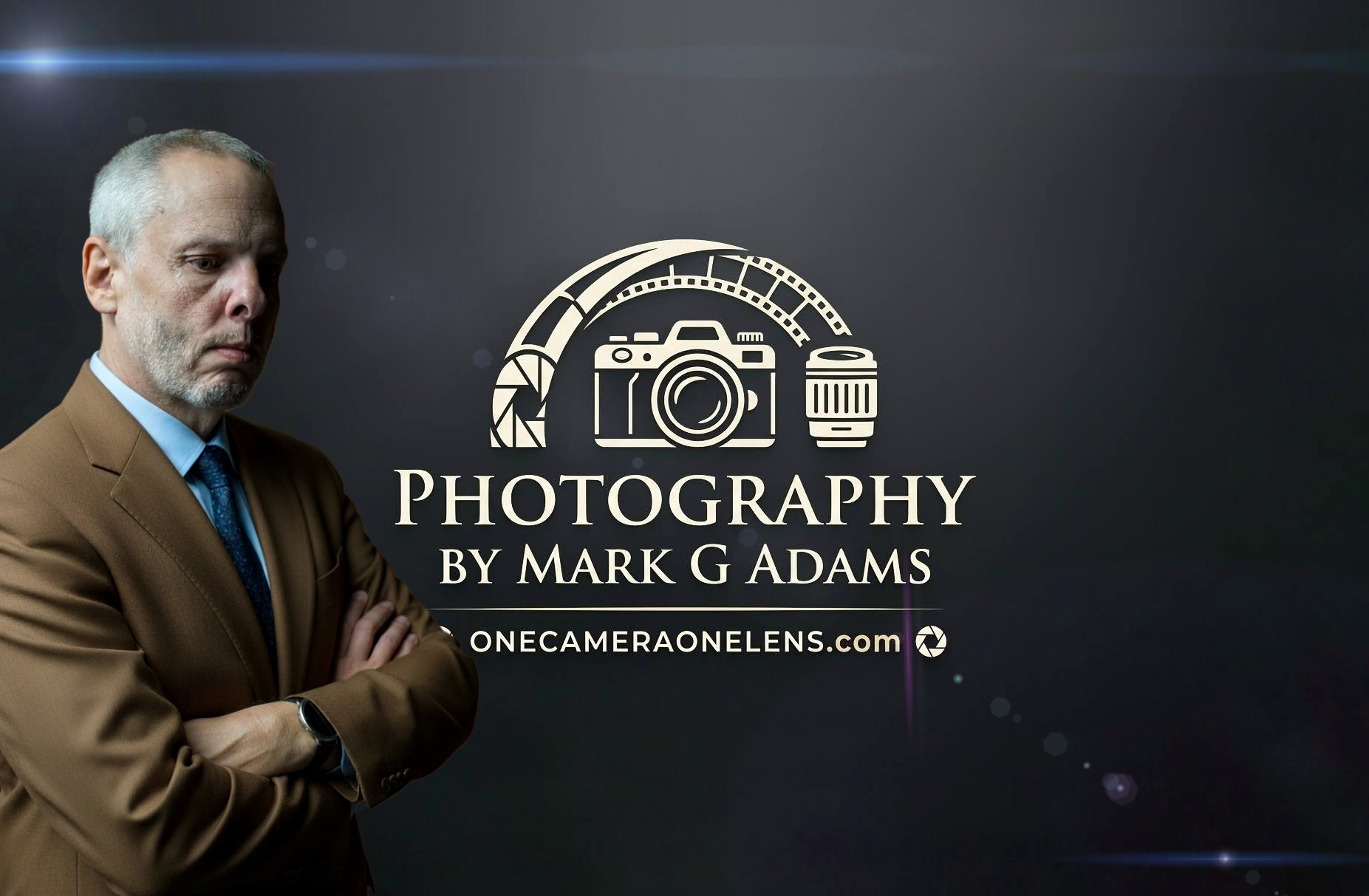

As you can see, I have decided to update my logo for One Camera One Lens. I’ve been thinking about it for a long time, and this is what I decided to design. It may go through some minor tweaks in the coming weeks, but the basic idea is there.
Hopefully, the change is for the best!

As I shoot both digital and film, I think the new logo represents that more with the little Polaroid hanging from the word “one” and also ensures the viewer sees the four separate words of “one camera one lens”.
While you’re here, I am looking for content suppliers for the site. If you have something you want to share to the growing audience, please let me know and I will get it on the site.
Thank you everyone. Will be back Tuesday with photos and more!
Mark.

A move in the right direction, nice LOGO.
LikeLiked by 2 people
Thanks Martin 🙏
LikeLiked by 1 person
There was nothing wrong with the old LOGO but the new one is nice, too. The only tweak that I would recommend is to change the shade of green. I don’t find the olive shade so attractive. It reminds me too much of the Army. LOL
LikeLiked by 2 people
Thank you! I shall tweak it a bit, and I agree with the green, there’s also another little tweak I want to make so… Stay tuned!
LikeLiked by 1 person