
I have been publishing images in a style and technique that I have been working on over the months. The idea is to make them look a little like “Portra” film, well, the skies anyway! After many people asking me about this, I decided to make a short video, along with this guide. As always with my “Darktable Simplified” series, I have made it as simple as possible!
What we are going to do?
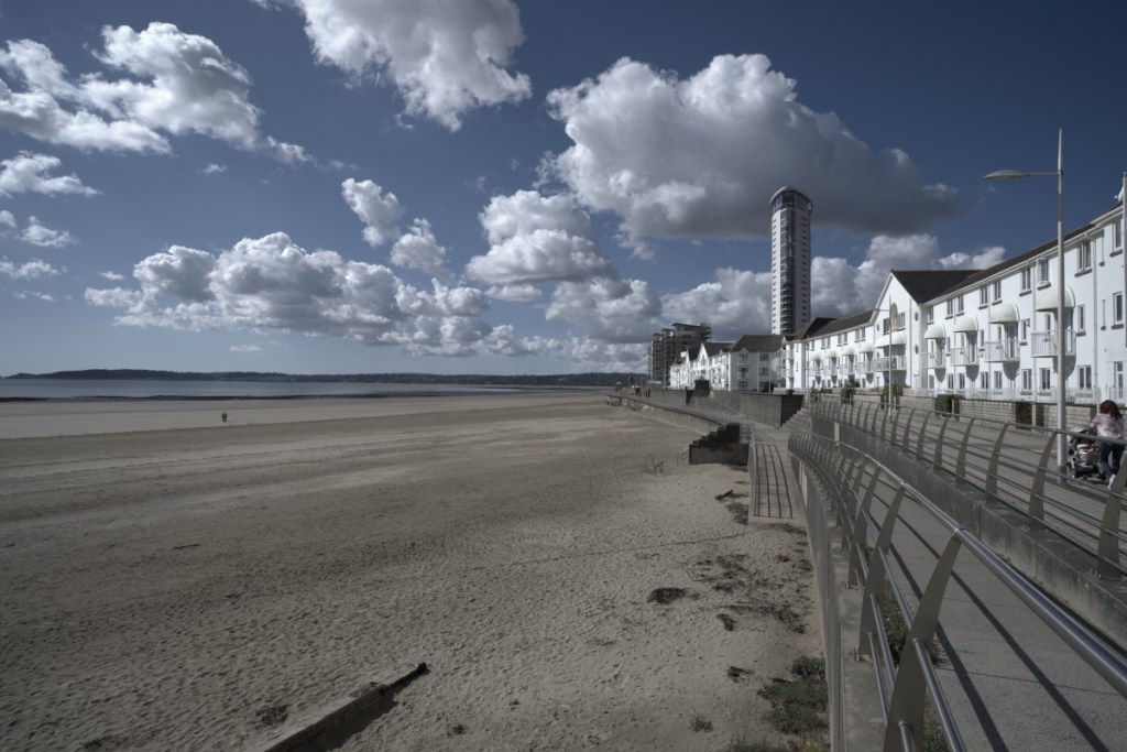
We will take these two images below (one a raw file, one a jpeg) and we will edit them using this technique. I chose a raw and a jpeg, as I know a lot of people use either/or format when they take their images, and many jpegs forget they can still edit their images.

What will the result be?
Once processed with this simple technique, the images will look something like this.
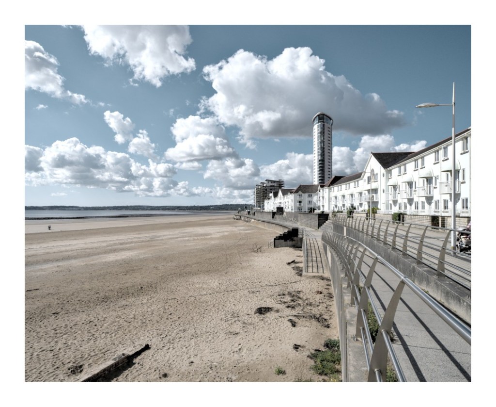
As you can see, quite a difference! And all done in a few clicks! Here is how.
Steps to this technique.
Here is the video of the technique.
Guide:
- Load up the image you want to edit into Darktable’s “Darkroom”
- Do your basic corrections of lens correctio, rotate and perspective and cropping.
- Press “o” on the keyboard to allow highlight/shadow warnings.
- Push up the “Exposure” so that you start to see red appear on the screen, where it will be over-exposed. Make sure it is only a little bit (as shown in the video) though, and the whole image is not completely over-exposed.
- Turn on “Filmic RGB” and press the “Auto Tune Levels” button.
- If needed, from within Filmic, adjust the other settings, including contrast, to your needs.
- Turn on “Local Contrast”
- On the “Contrast Equaliser”, choose the “Clarlity” option, set the uniformly mask at 70% (or adjust as needed).
- Enter the “Color Zones” module. On the BLUE section (for each of these) adjust the “Lightness” setting, raise as needed. On the “Chroma” tab, lower about a quarter of the way down and on the “Hue” tab, bring it down to get the blue you need (see video).
- Add a frame!
I hope that was simple enough. Of course, do not forget to do all the other editing you need to do in the image, including highlights and shadows using the “Tone Equaliser” (as shown in the video). Just adjust the colours as needed. The most important part to learn from this video and tutorial though is the importance of getting a super bright exposure in your images! We see so many images where the exposure is not as bright as it should be!
Please feel free to leave comments, questions etc below!
Thank you once again.
Mark

What a great tutorial Mark, I think you will make a lot of people happy with this.
And also the short written walkthrough is something many like.
Perhaps unintentionally, but you have successfully developed a kind of Fujifilm simulation that can be applied to both raw and jpg files from various cameras. Although some adjustments may still be needed, the overall outcome remains impressive.
Maybe it’s worth considering making it a DT style from it ?
Cheers Mark!
LikeLiked by 1 person
Yes, it is actually a style that will be a part of my “Darktable Styles Part 3” set. I have a few new ones since my last release.
Thank you once again. I hope you’re feeling good and everything is going well.
LikeLiked by 1 person