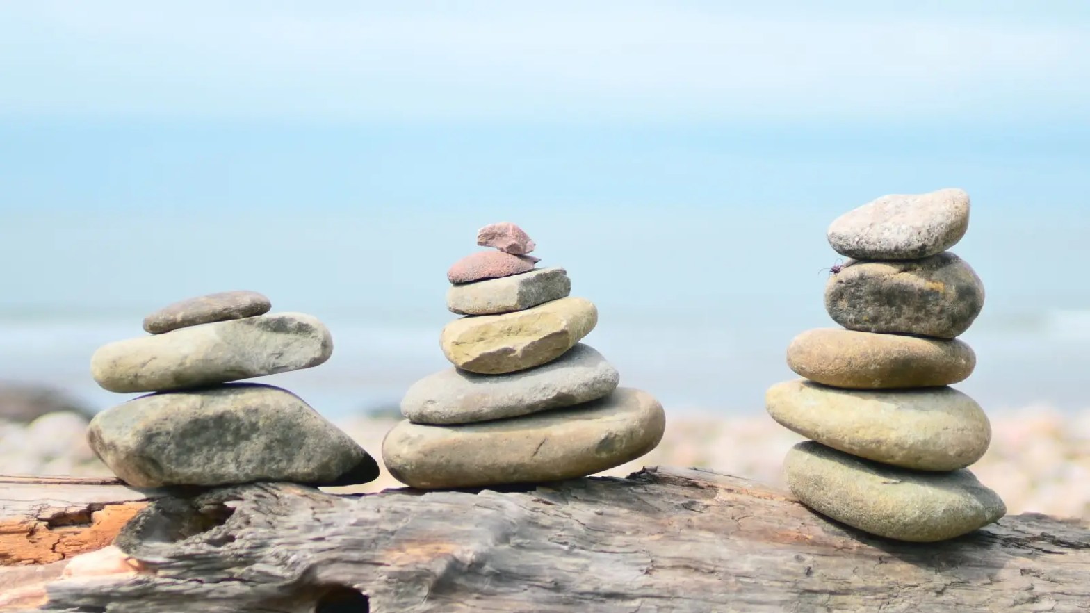
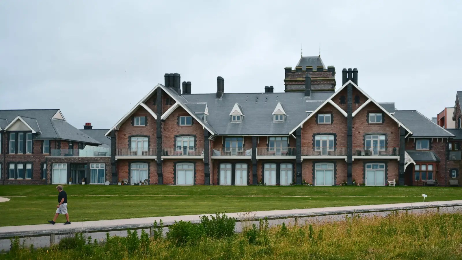
Today I just wanted to experiment. I knew I wanted to capture cinematic pictures, and I knew I wanted to try out two new recipes. So armed with my Nikon ZF and Z35mm F/1.4, out I went with a few friends and snapped.
All these images are straight from camera, I have not straightened them or corrected anything in them, they were shot in camera at 16:9 ratio (and I did use my DX crop mode for more reach when needed). The couple of portrait orientation images I cropped to 4:5 as I think they worked better than the 16:9 they were shot at.
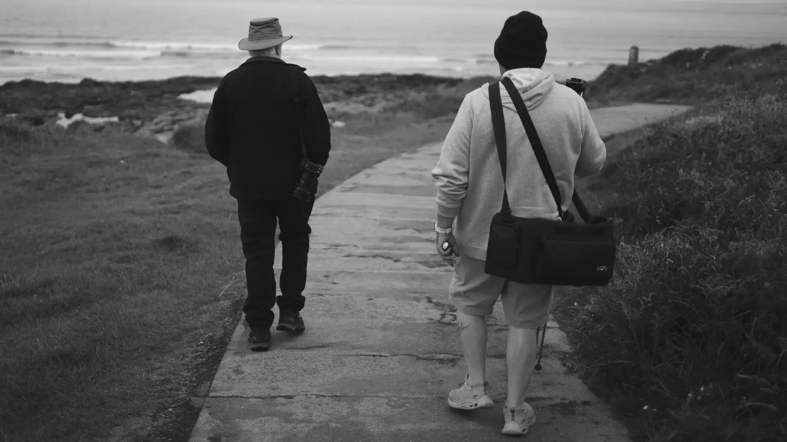
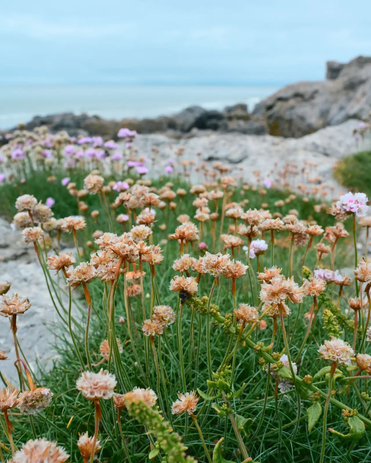
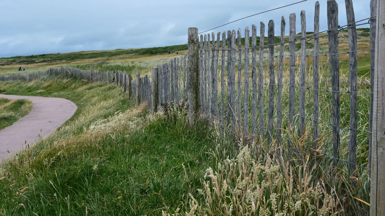
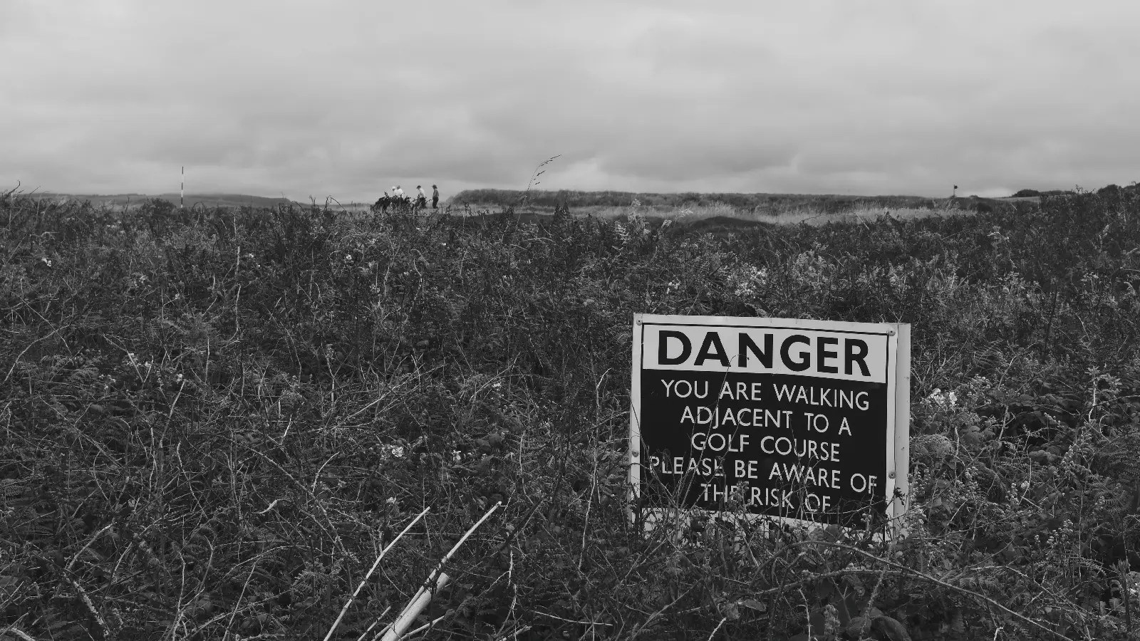
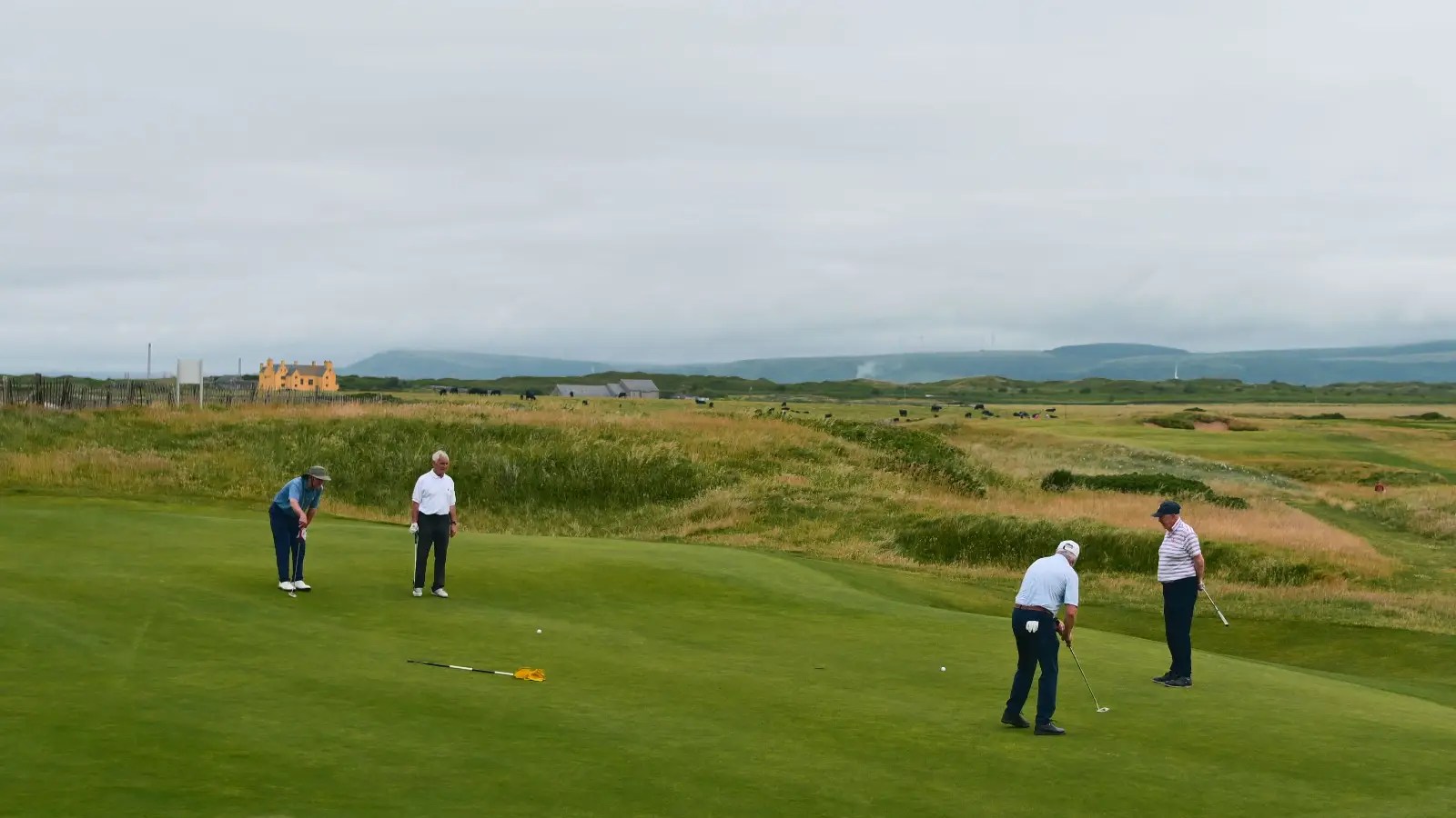
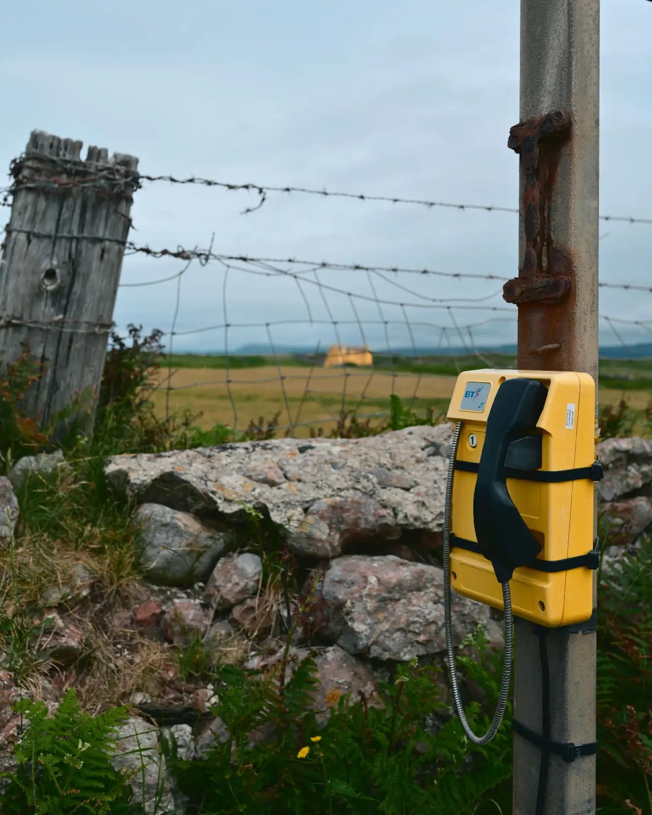
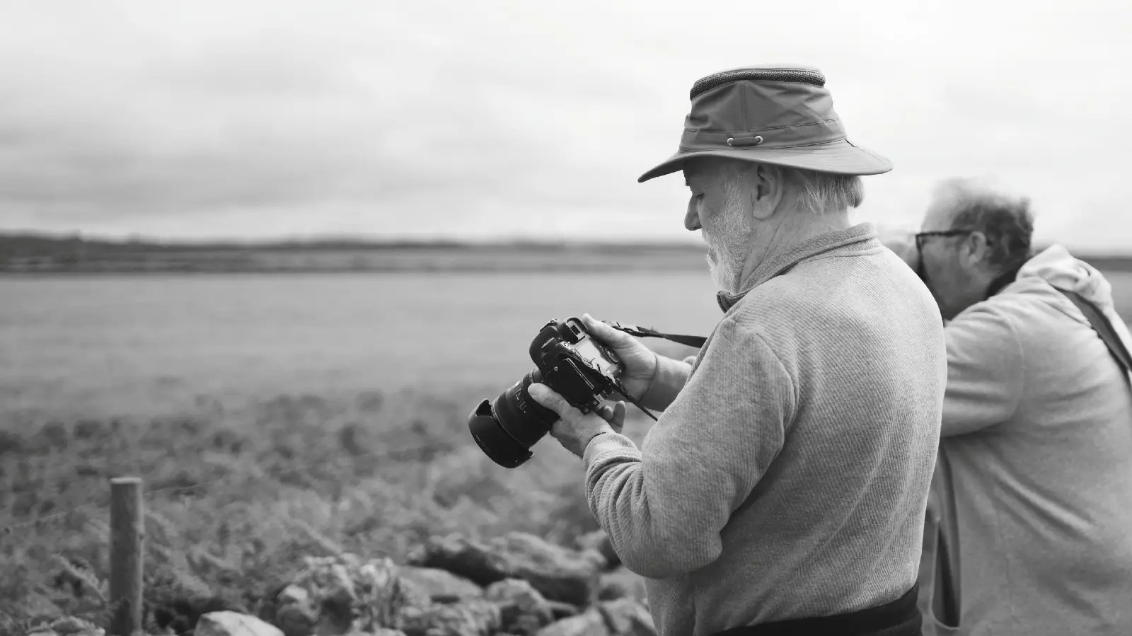
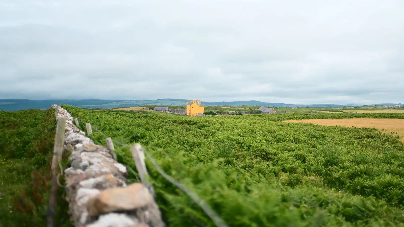
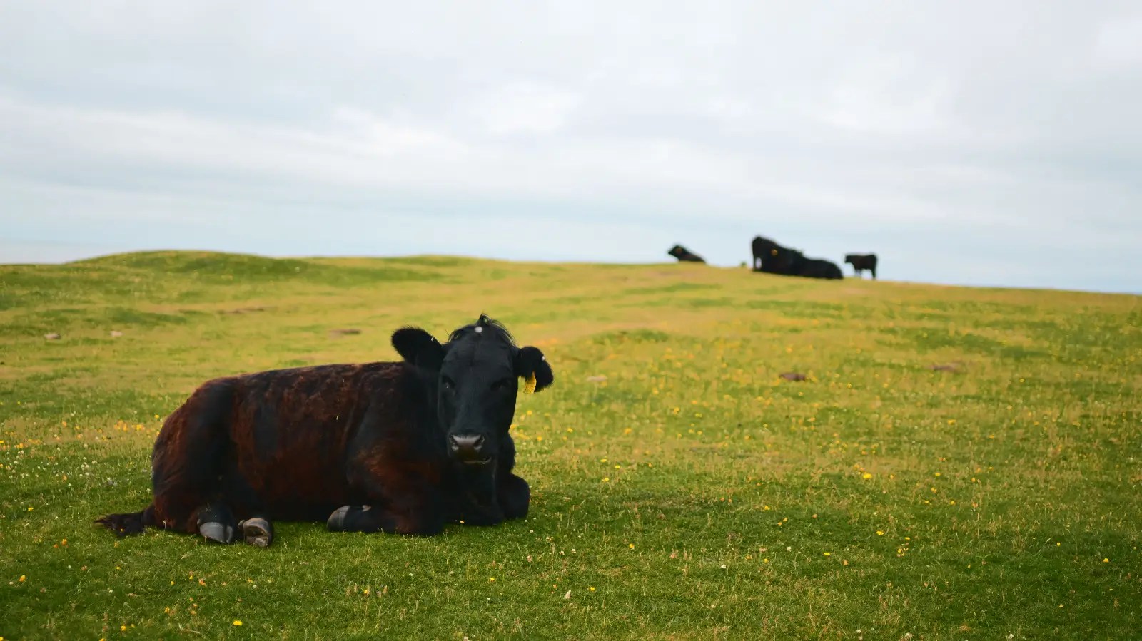
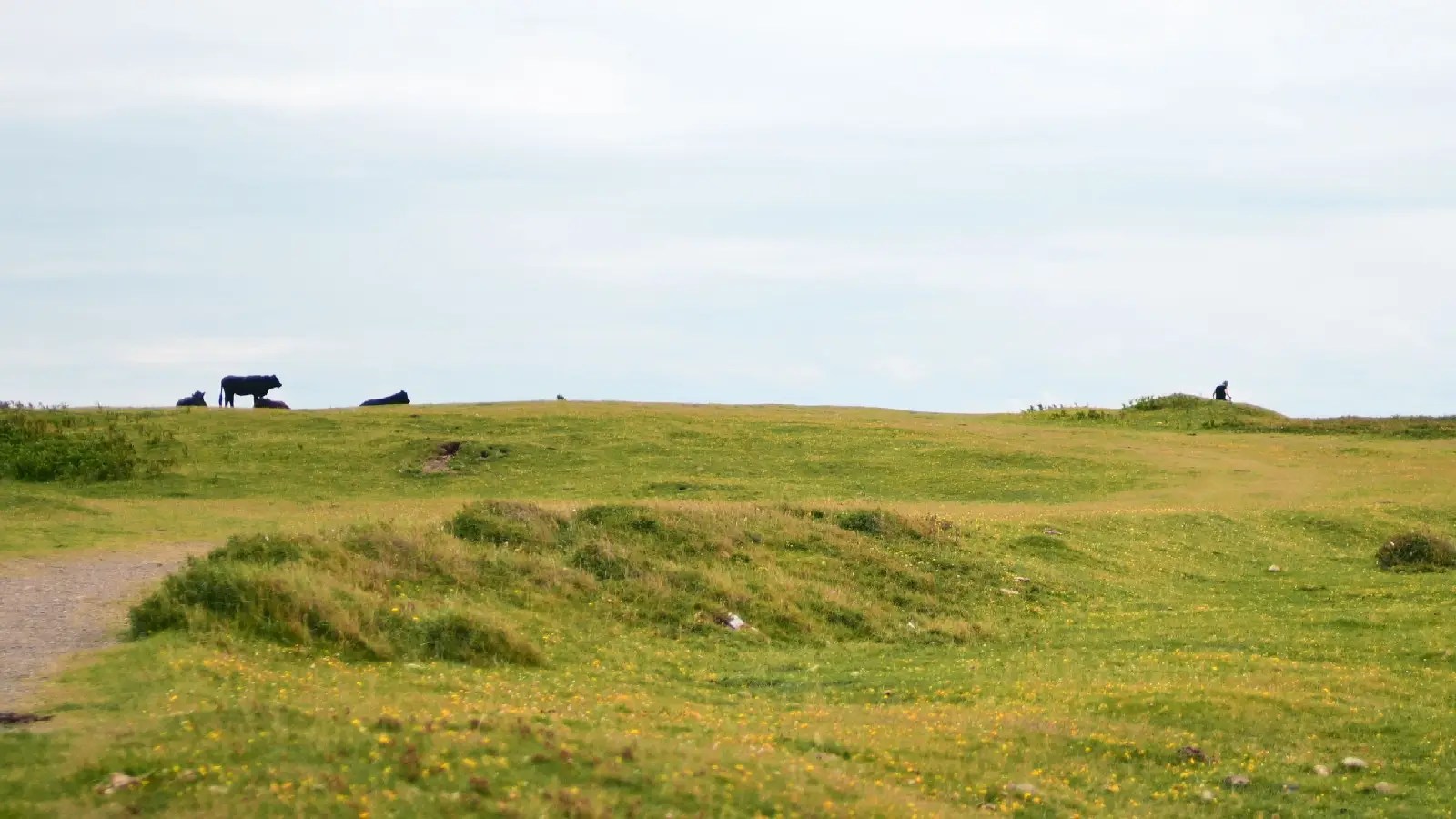
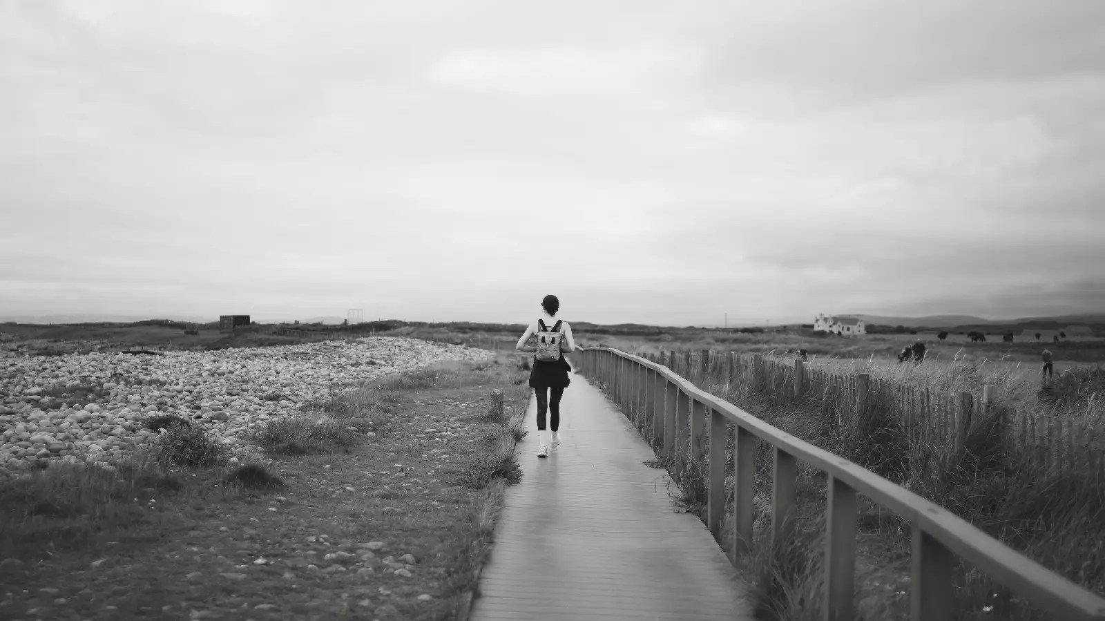
I am working on a “look” for when I want to use jpegs for weddings, events and portraits (not all photos are always from raw files when you have thousands of images!) but I think it is a nice look regardless of what it is for!
My name is Mark G Adams and I run Photography By Mark G Adams. I am a professional photographer from South Wales, shooting weddings, events and portraits as well as running meets and workshops. For fun I like to shoot landscapes, wildlife and occasionally do street photography. Enjoy my website as I share my knowledge learned over decades of working and having fun in photography.
You can find all the latest articles and blogs on my homepage here.
My main photography social media page is my Photography By Mark G Adams page.
Nikon Recipes for the Z system can be found here.
You can find a complete list of my gear here.
DOWNLOAD THE LATEST “ADVENTURES IN PHOTOGRAPHY” MAGAZINE FOR FREE HERE
 Photography By Mark G Adams
Hey Mark, I’m a big fan of the 16:9 format myself. I rarely publish anything in a different aspect ratio, and there are quite a few gems in this collection as well.
By “the look,” I assume you’re referring to the dialed-in recipes. Some of them are really beautiful, especially that black-and-white shot of the walker on the wooden boardwalk, that’s an outstanding image. That said, I’m not sure the look works equally well for every subject. I feel the same way about some of the colour images. The tonality is very appealing, but certain colours can become a bit tricky depending on the scene.
Of course, that’s just my personal taste, and I could be completely wrong. Photography would be a pretty boring hobby if we all saw things exactly the same way. 😉
LikeLiked by 1 person
Thanks Marc. I always like to try out a new recipe I’m working on in different environments before I’m happy and use them for things they are not intended for to see how they “look”.
I’ve tested this on indoor and outdoor wedding images and the results have been mostly pleasing, so this was a stress-test in severely changing light and conditions mixed different subjects from beaches to golf courses.
The main focus is to dampen the horrible greens we have the year, and mute the skies while ensuring skin-tones are kept under control.
LikeLiked by 1 person
That makes perfect sense. Looking at your explanation, it sounds less like you’re creating a “look” and more like you’re solving a specific problem. Taming greens while keeping skies and skin tones under control is quite a balancing act. I can definitely see why you’d want to test it across completely different subjects and lighting conditions before calling it finished.
LikeLiked by 1 person
And looking at the pictures, the grass is not yellow like it looks with the cow shot, those are buttercup’s and yellow weeds. There were fields of greens and yellows down there!
(I only mention that as without knowledge it looks like the grass has turned yellow in some places).
LikeLiked by 1 person
No, not at all, that was still perfectly clear. I was thinking more of image #9, I believe. It’s a beautiful photograph with the stone wall and the landscape, but the building in the distance ends up drawing a little more attention than I’d personally like. Of course, that’s just my impression and taste speaking. But as you mentioned yourself, that’s exactly why you test these recipes in different situations and see how they behave across a variety of subjects and conditions.
LikeLiked by 1 person
Ah yes! The bright yellow building is a talking point in the area! A million pound mansion painted bright yellow (it’s not just you!) Lol.
Thanks Marc.
LikeLiked by 1 person