
Darktable has its own presets that are known as Styles. They’re a powerful and useful part of editing in Darktable, and they can be great starting points to give your images a consistent look and feel. As a major contributor to Fujifilm film simulation “recipes”, it’s been at the back of my mind for a while to create a set of useful colour modifying presets to Darktable. Here I present my second set of DT Styles, with a further 12 for you to enjoy.
Before You Start
Many, if not all Styles currently available (except my initial selection of Darktable Styles) are based on older versions of Darktable, and use many deprecated modules. These new Styles that I have put together assume your default workspace is for the newer “Scene Referred” workspace to ensure they are compatible with all the newest versions of Darktable.
Ideally, there are a few steps you should take just before, and just after applying the Style required (however because of the nature of the modules in use, it isn’t always a necessity).
For optimum results I would advise:
1. Turn on your lens correction module.
2. Make adjustments to your horizon level.
3. Crop the image as required.
4. Choose your desired Style from the 14 available on this page.
5. Adjust the exposure module and filmic module (white relative exposure and black relative exposure is a must, contrast is up to you) or use the new Sigmoid module.
*NOTE: These DT Styles have been tested using both Filmic RGB and Sigmoid and I am happy that the results using either method are near identical.
Next Steps
The look is now complete and you can tweak your image from here. The saturation (30) and chroma (15) are deliberately set to the level they are at initially. The way I’ve developed the DtStyles needs initial saturation. If you find the levels a bit too much on certain images, go into the Colour Zones module and reduce the opacity slightly.
Certain Styles work better with certain subjects, although of course, you can use them as you see fit. As a guide, this is their suggested use.
Your new DT Styles are here with examples.
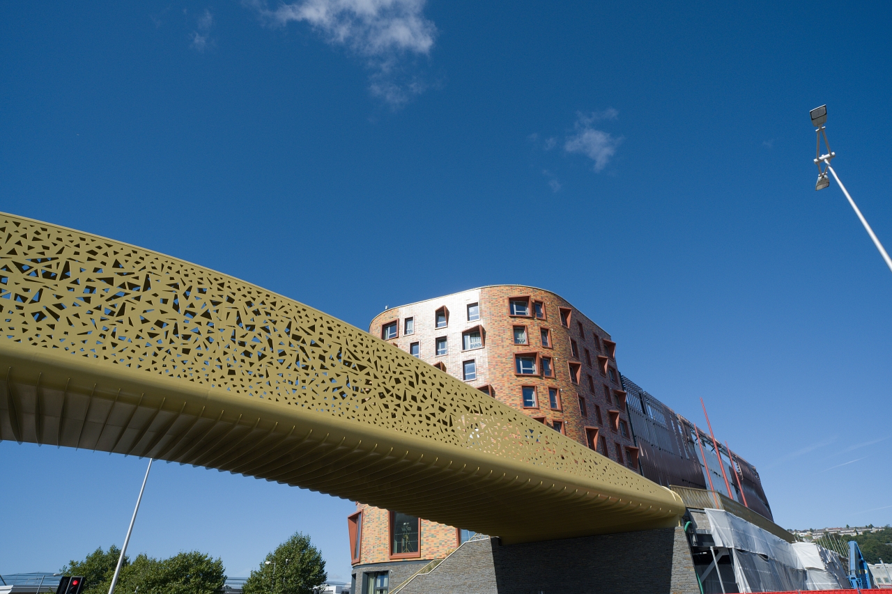
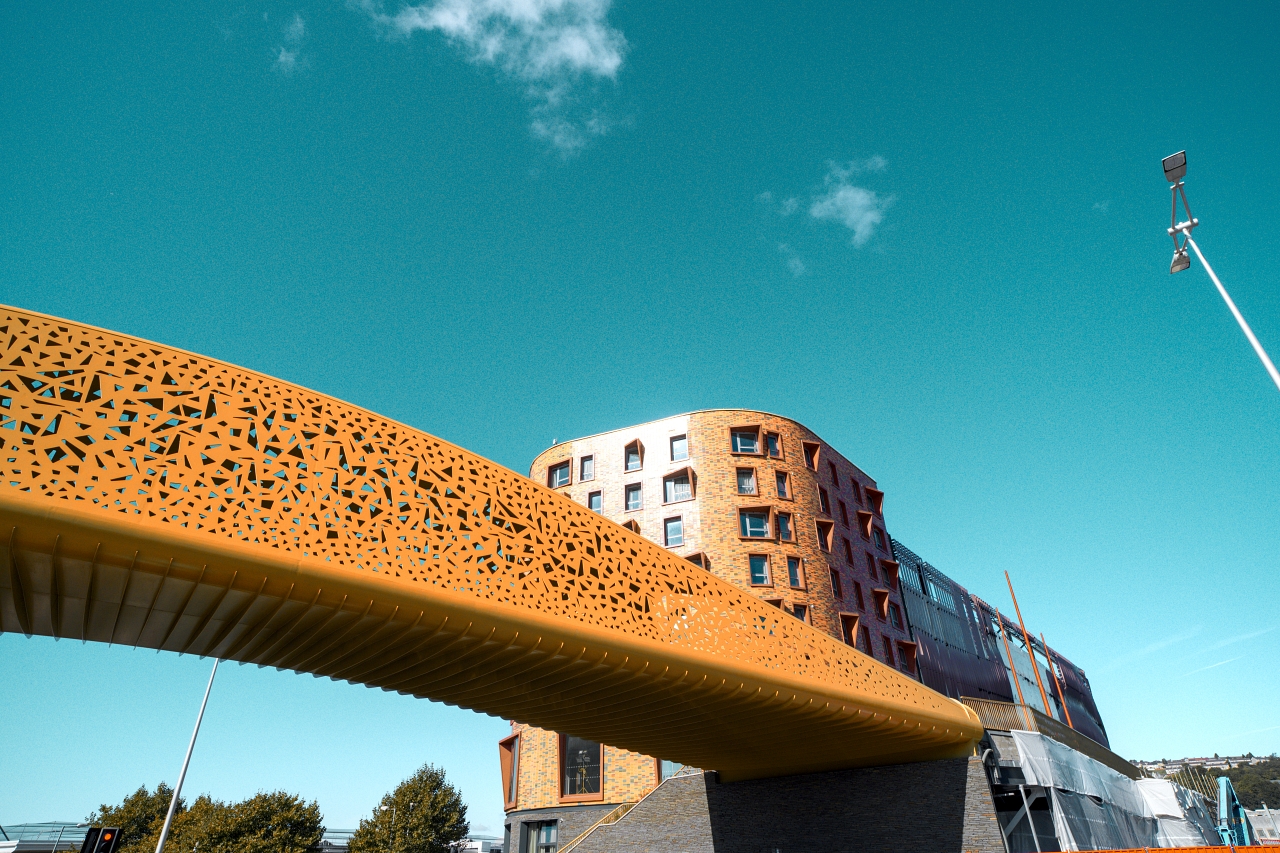
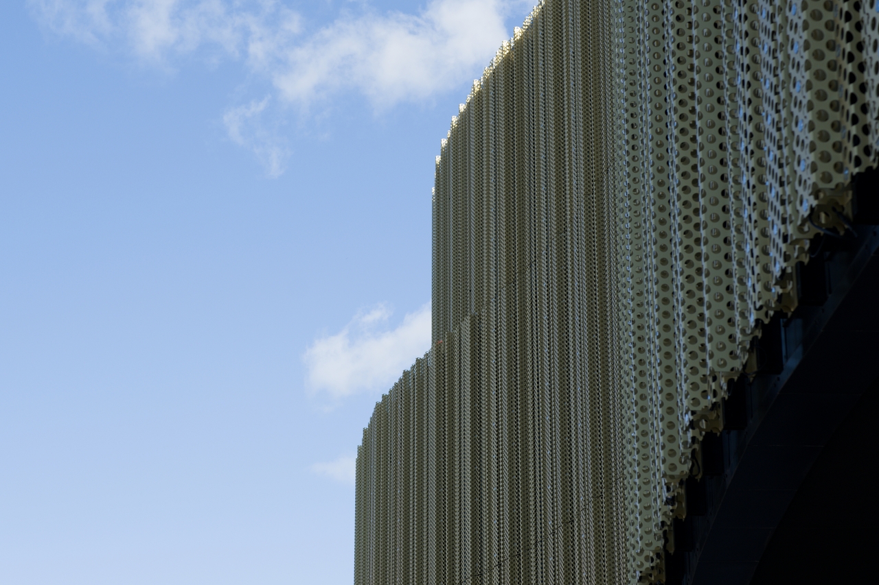
Agent Orange – An artistic Style perfect for cityscapes, architecture and even landscapes.
This is a great artistic DT Style that can give great results to images. It works well with big skies and colourful buildings!
Change Extra – An alternative to Chrome It! A bit brighter and more airy.
The original “Chrome It!” DT Style was extremely close to the Fujifilm film simulation, this version just gives Chrome a little bit of a boost.

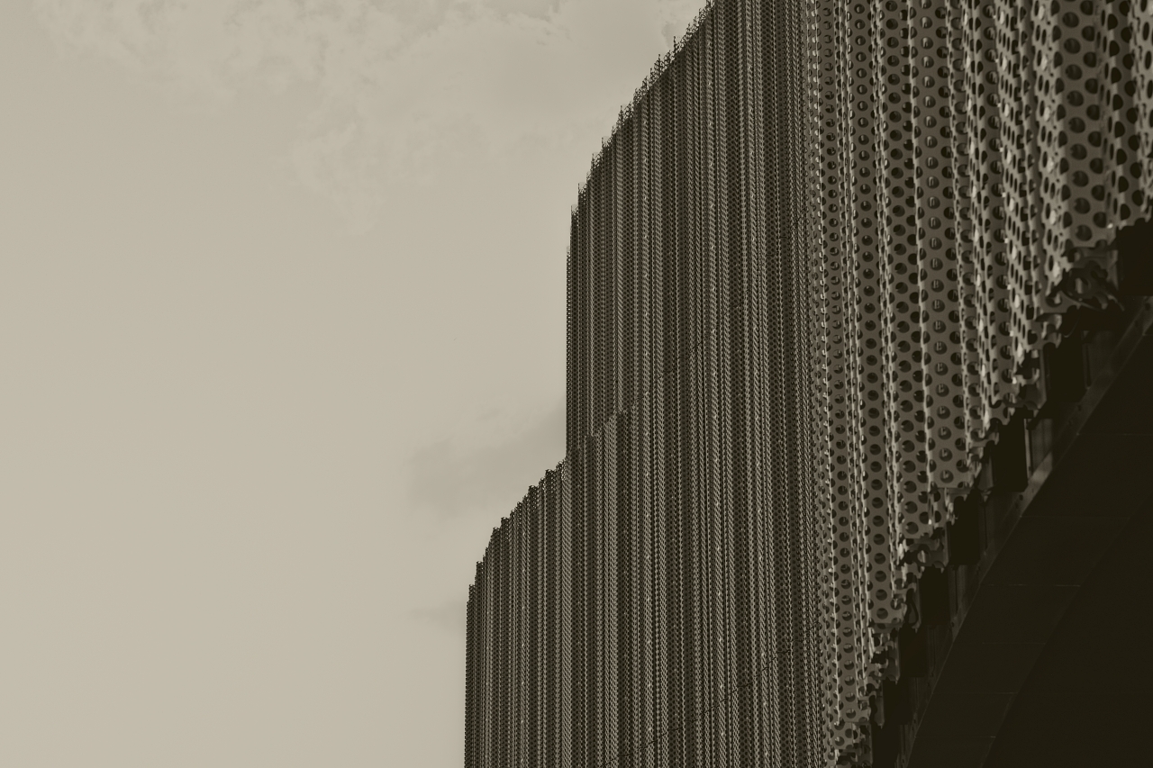
Crunchy Sepia – Sepia with crunch!
Unlike other DT Styles that I have created, this one also adds more clarity to your image, so don’t be surprised if you see extra options popping up in your history stack!
Gotham – Popping red/orange with faded other colours.
This is such a fun DT Style, it de-saturates most colours, but keeps reds/oranges/yellows quite bright. It also works surprisingly well on night time photographs!
Monochrome Contrast – Contrasty black and white, making bright skies and darker dark colours.
A nice monochrome look, with a lot of contrast between colours.
Monochrome Darksky – A monochrome look that will darken blue skies.
This gives a darker sky and works well as an alternative monochrome DT Style.


Monochrome Foilage – Ideal for landscape photography.
Currently no example. Ideal for images with a lot of greens and autumnal colours.
Monochrome Portrait – Highlights the face and perfect for portraits images.
Currently no example. Perfect for portraits! Skin tones will shine and your portraits will look amazing in monochrome.
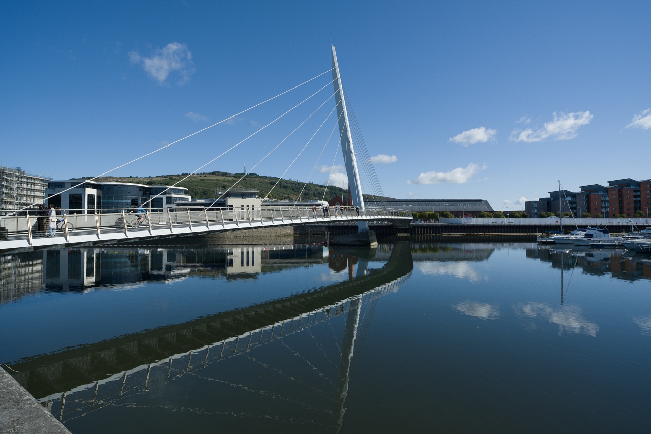
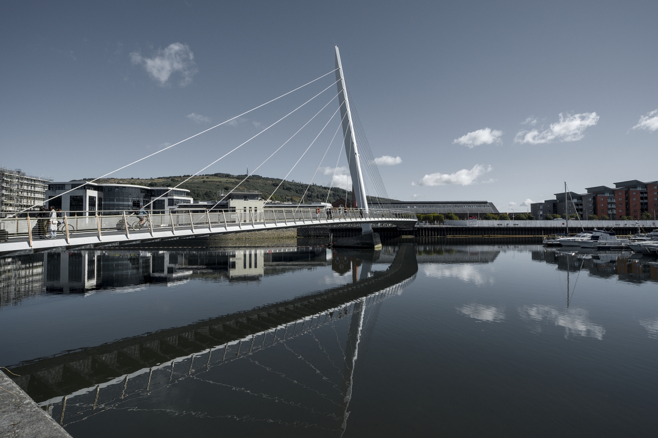
Natural Look – Taking the look from your raw file and giving a natural look, with fine tweaks for natural colours.
This has become a firm favourite with me lately. As you can see in the side-by-side example, it gives very natural colours in just one click of your DT Styles button!


Natural Colour Portraits – Perfect for natural looking portraits.
Currently no example – See DT Style “Natural Look” as this is a tweaked version making it more suitable for portraits.
Radiant – Natural looking images with a radiance about them.
Radiant is a great DT Style for most types of images, and it gives them a nice radiant and vibrant look. Originally this was going to be a version of Velviatic, but it drifted from that enough to give it its own name.
You’ll find a selection of images using the Radiant DT Style here
Velviatic Portraits – Velviatic for portraits, it will leave the skin tones untouched.
Currently no example. This gives the Velviatic punch, but tones down the skin colours.
Final Words
Some people consider Darktable to be quite difficult, even after a lot of practise. These styles are just meant to give you starting points to your work, or used “as-is” if you want. Personally, I have been using them with just minor tweaks.
Use them to learn about Darktable, or use them as a tool to create your images. However you use these, just enjoy using Darktable and feel free to share this article with others.
If you want to add to the Colour Zones presets to your Darktable, you can load up the individual Styles from the download, and then one by one go into the Colour Zones module and name the setting the same as the Style you applied.
Downloads
Download the original DT Styles set by visiting here (full of examples!)
Download a selection of DT Styles Part 2 here.
Thank you for your time, I hope you enjoy these. If you do, you can support me by looking around this website, or a donation via PayPal to mgadams1970@gmail.com really helps! Thank you!
More Darktable articles by me include… Ultimate Darktable Resource & Guide, Quickly Get A Workable Image In Darktable and Why Darktable Is Perfect For Fujifilm Users plus many more on my blogs section!
And don’t forget my YouTube Tutorials!
